Saturday, 29 October 2011

Project 3: Behaviour Concepts

My three concepts were all about floaty particle weirdness, because I had a concept in mind related to particles and was trying to find the best way to realise it and give it a thematic home. In the end, I chose concept 1 - Ship - because I feel like it's the purest form of this original feeling.

Elle commented that concept 1 was interesting aesthetically but lacked any real interaction with the environment, so after thinking some more about it, the plan is to make the ship interact with a lamp or lamps, like they are somehow beacons or lighthouses. The ships are supposed to be representative of a journey over time, a pilgrimage of thoughts and perhaps moods, so having light to show them the way fits in very nicely.


Saturday, 1 October 2011

Final Renders

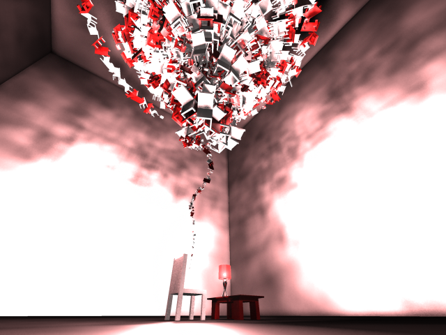
The full story behind Jumbleton is written up in the documentation I handed in, but the mood is pretty apparent just from looking at these shots.


More Development Renders

Putting the lamp and the table in with the chairs made things look a bit more interesting, and it finally looked how I had imagined it once tweaking the numbers. I decided at that point to focus on rendering and presentation from then on, rather than any more coding or modelling, just because I knew how long it would take and what an important part of the process it is.

These pics show the development of the darker take on the original concept, with the furniture swirl not being something playful but rather something looming and imposing. The scale, colours, lighting and shadows all began to reinforce this theme as I refined the environment further.


Turning up the lights too bright did kinda ruin the effect.


This render uses one white overhead light, in the centre of the furniture swirl, because at the time there were over 100 lamps in the scene and I thought all that lighting would slow things down. I got this wonderful spiral shadow effect on the chair and spent some time recreating it later for one of my final renders.


Proper illumination and glow on the lampshades themselves (rather than just the bulb objects) paid off so much.


The shadows! They speak to me.


DOF fail:


Two renders from when I was setting up the base scene:


Wednesday, 21 September 2011

House and Contents

So here are the latest things to be added to the pile, a lamp and a little side table. I still have to figure out how to import objects from external files, since I've not been working like that so far and I think it would be useful.


Monday, 19 September 2011

Textmate spits the dummy

Come on Textmate, get it together mate.

Organising chaos

I've been playing with scale some more, and although my original ideas called for an approach that suggests some kind of gravity in the environment, I really like the floating trail of chairs, shrinking down to sit on the original chair.


I had an idea for arranging the chairs based on their angle too, and wanted to try it out. I'm not yet sure whether it's better than the chaotic mess it is otherwise. There's something more ... monolithic and intelligent about it now. It's much more sinister, especially with the chair legs facing out.


I then added some relative randomness, to rough it up a bit. The cold and orderly version has a different feel to the roughed up version, I think roughed up is more in line with my aims.


So the big question is: legs in or out?

Elle has suggested, and I think she might be right, that I start polishing the aesthetics now and leave the minor tweakings for last. This makes a lot of sense, seeing as the whole look of the thing will be altered by adding in extra geometry. It is time for lamp, side table, and some other furniture.

Cones of silence

The cone code took a while to iron into something that looked sort of right, and adding powers and things was necessary to shape it with a curve rather than a boring flat edge. Luckily, JP taught us these things in his infinite wisdom, so I know how to do them! That worked out well.


This is looking very healthy and chunky and mangy. You can start to see the problem with the cone code in that last image though, the tapering bottom is too sparse. Chairs get filtered out if they do not sit on a point inside a defined radius, given their height, but to maintain uniform density it is still picking locations within the whole bounding box, meaning chairs don't naturally fall into the narrow bit often enough. Increasing the density would just add too many chairs in other parts of the cone.

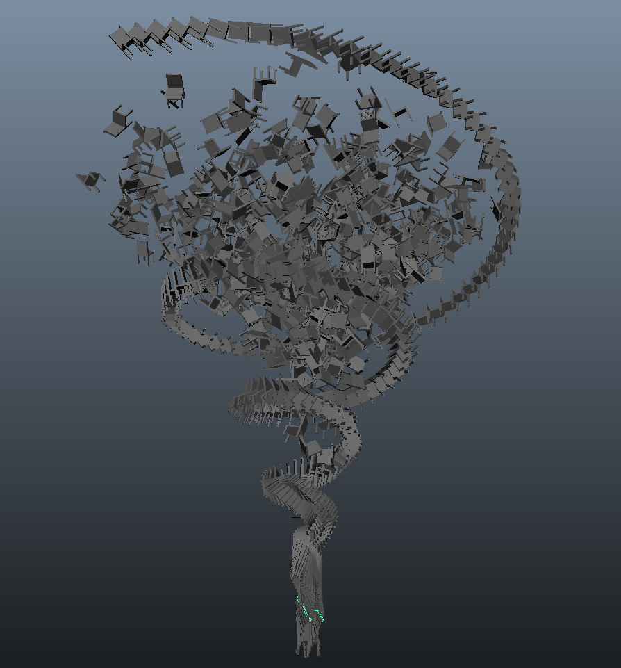
While I was fretting about this, however, a magical thing happened. A certain Miss Eleanor came to sit next to be, and bestow her Eye of Discernment upon my work. Noticing that the spiral was denser at the bottom, and the cone denser at the top, she suggested I combine the two forms. I had actually considered this, but somehow decided against it in my head before even trying it. Somehow when Elle suggested it, it made sense.


And behold! From so simple a beginning, endless forms most beautiful and most wonderful have been, and are being, evolved.
That's Darwin, you guys. Isn't he great?


That last one has an incremental rotate on the spiral to highlight itself against the chaotic background, but I don't know if I want it to stand out that much. The spiral also doesn't wrap the cone tight enough. Numbers, numbers, everywhere.